


Chương 5-Bài 1. Vẽ trái tim và làm hiệu ứng tim đập HeartBeat bằng CSS
Tác giả: Dương Nguyễn Phú Cường
Số phút học: 116 phút
Số phút học: 116 phút
Ngày đăng:
11/7/2026, 6:1
Lượt xem: 2732
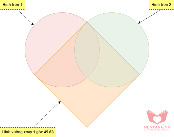
Phân tích hình vẽ trái tim
Chúng ta có thể vẽ hình trái tim đơn giản bằng cách sử dụng các hình sau để ghép nối lại:- 1 hình vuông, xoay 1 góc 450
- 2 hình tròn
- Như hình minh họa sau:
Cách thực hiện trong trang web bằng HTML và CSS
Code HTML
- Nội dung file
index.html
<!DOCTYPE html>
<html lang="vi">

<head>
    <meta charset="utf-8">
    <meta name="viewport" content="width=device-width, initial-scale=1.0">
    <meta name="keywords" content="Nền tảng,HTML,CSS,XML,JavaScript, Lập trình C#, Lập trình, Web, Kiến thức, Đồ án">
    <meta name="author" content="Dương Nguyễn Phú Cường">
    <meta name="description"
        content="Cung cấp các kiến thức Nền tảng, cơ bản về Lập trình, Lập trình web, Lập trình di động, Cơ sở dữ liệu, ...">
    <meta property="og:locale" content="vi_VN">
    <meta property="og:type" content="website">
    <meta property="og:title" content="Nền tảng Kiến thức">
    <meta property="og:description"
        content="Cung cấp các kiến thức Nền tảng, cơ bản về Lập trình, Lập trình web, Lập trình di động, Cơ sở dữ liệu, ...">
    <meta property="og:url" content="https://nentang.vn/">
    <meta property="og:site_name" content="Nền tảng Kiến thức">
    <title>Vẽ trái tim và làm hiệu ứng tim đập HeartBeat bằng CSS | NenTang.vn</title>

    <!-- Custom css - Các file css do chúng ta tự viết -->
    <link rel="stylesheet" href="assets/css/app.css" type="text/css" />
</head>

<body>
    I <span class="heart"></span> you.

    <!-- Custom script - Các file js do mình tự viết -->
    <script src="assets/js/app.js"></script>
</body>

</html>
Code CSS
- Nội dung file CSS
body {
    background: #333;
    color: #fff;
    font-family: 'Archivo Black', sans-serif;
    font-size: 5em;
    margin-top: 1em;
    text-align: center;
    text-transform: uppercase;
}

.heart {
    background-color: red;
    display: inline-block;
    height: 30px;
    margin: 0 10px;
    position: relative;
    top: 0;
    width: 30px;
    animation: nhiptim 800ms infinite;
}

.heart:before,
.heart:after {
    content: "";
    background-color: red;
    border-radius: 50%;
    height: 30px;
    position: absolute;
    width: 30px;
}

.heart:before {
    top: -15px;
    left: 0;
}

.heart:after {
    left: 15px;
    top: 0;
}

@keyframes nhiptim {
    0% {
        transform: rotate(-45deg) scale(0);
    }
    100% {
        transform: rotate(-45deg) scale(1.5);
    }
}
Kết quả Demo
Xem demo tại: http://frontend-advanced.learning.nentang.vn/tuts/ve-trai-tim-va-lam-hieu-ung-tim-dap-heartbeat-bang-css/index.htmlNguồn tham khảo: https://css-tricks.com/hearts-in-html-and-css/
Ủng hộ tác giả

Bình luận
Bình luận của bạnNền tảng các kiến thức học tập
Cùng nhau học tập, khám phá các kiến thức nền tảng về Lập trình web, mobile, database nhé.
Nền tảng kiến thức - Hành trang tới tương lai hân hạnh phục vụ Quý khách!
Khám phá, trải nghiệm ngay
Vui lòng đăng nhập để gởi bình luận!
Đăng nhậpChưa có bình luận nào!